Why are some posters, magazine covers and sculptures so exciting to look at and seem to invite us to explore the graphics so easily? Obviously there was a designer, a communication designer, a sculptor or other creator behind the work who put his or her ideas forward.
Various aspects or design elements such as colour and contrast are at work to create this seemingly pleasing or even upsetting piece. One central aspect will be the visual flow and creation of a focal point.
Creating a focal point helps the viewer to explore the work in a seemingly natural and intuitive manner. It seems obvious what you should look at first and where your eye should move to from there.
How do you create a focal point?
You can create a focal point through a clear visual hierarchy of your work. This means that you actually plan what element you want to be dominant, what element sub-dominant and what element to be subordinate. This is like a scale of importance and can be achieved by making the dominant element (e.g. a heading) larger than the other elements, or using bold text or even by choosing a high-contrast tone (e.g. black against a white background) or by choosing a bright colour that pops and stands out or simply by placing the element in an important position (e.g. placing the heading at the top of a poster, as English is read from left to right and top to bottom).
Below are some posts on Dominance, Sub-dominance and Sub-ordinance and some visual examples.
Design Principles at Online Design Teacher
Dominance: Creating Focal Points in Your Design on Vanseo Design
ABC of Design – excellent resource, but you may need to search for the content for a bit
Found on Behance.net by Ricardo Garcia
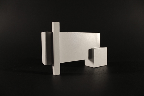
‘Fragment Sculptural Vase’ on SlideShare by sfast08
